
The best way to choose a design for your custom T-shirt is to know your audience. Look at your customer data to find out what kinds of images or graphic designs they respond to best.
The colors you choose say a lot about your brand. Serif fonts offer a classic look, while sans-serif fonts add modernity. When framing your design, try to have the subject break through that frame for more visual interest.
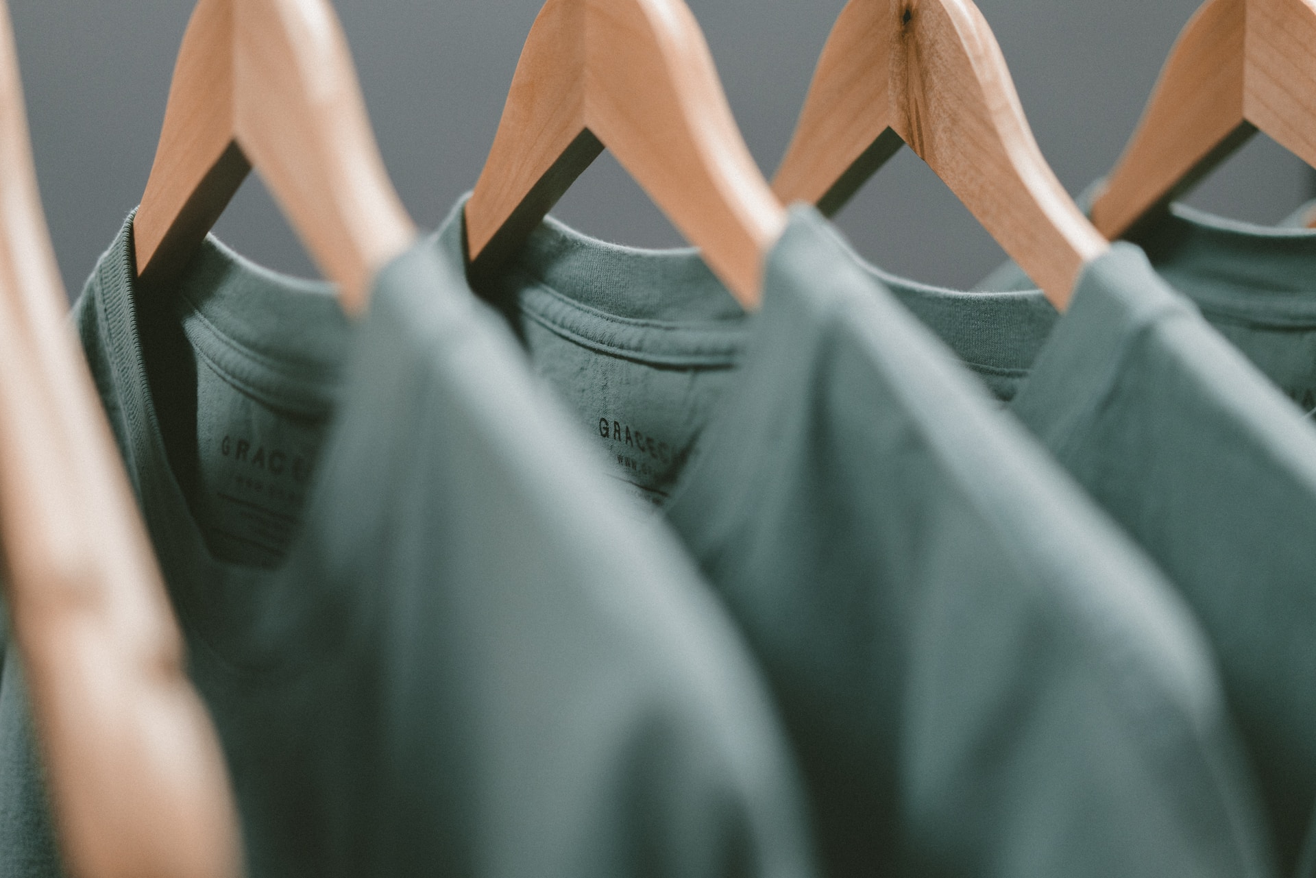
Colors
Whether you’re designing a T-shirt for a special event or your business, the colors in your design will play an important role. They can communicate a message, reflect your brand or personal style, and influence your audience’s product perception.
The color of your shirt’s fabric is also important. The ink colors used for printing should match the color of the shirt and provide a strong contrast so your design can be read from a distance.
When choosing colors, using a color wheel for inspiration is helpful. Analogous colors are located next to each other on the wheel, while complementary colors are opposite. These types of schemes can create striking and memorable designs. You can also try a monochromatic scheme with various shades of the same color.
Layout
If you want your custom T-shirts to look good, consider the layout. That means not overcrowding your design or adding too many images and logos.
The best way to prevent this is by working backward, meaning choosing a print provider and determining their “specs” or printing requirements. This will give you an idea of their preferred size, colors, and image format.
Typography also plays a significant role in the quality of your shirt, and it’s essential to keep readability in mind.
Fonts
Many people need to realize that fonts have just as much of an impact on the overall look of their shirts as the colors or illustrations. Fonts can communicate emotions and make your design look more serious or fun.
If you want your T-shirts to stand out, try using artistic fonts. These fonts range from hand-drawn styles to graffiti lettering and work well for designs that want to convey creativity, individuality, or rebellion.
When choosing a font for the T-shirt printing, make sure it’s bold and legible at the size it will be printed on your T-shirt. Avoid fonts that are too thin or too thick, and keep the number of fonts to a minimum. More fonts will prevent the design from appearing messy and challenging to read.
Images
Choosing the right images or graphic designs is crucial for purely image-based shirts. Ensure you have commercial licenses for any pop culture or other copyrighted photos, designs, and artwork you plan on using.
Similarly, any non-vector images should be sized to match the print size, ideally 300 dots per inch (dpi). Altering the file’s size without maintaining this resolution can make the design appear blurry or pixelated when printed.
Other Details
You should keep some critical details in mind regarding T-shirt design. For example, you want to ensure that your image is sized correctly for printing. It is also essential to use a print provider that offers mockups for your designs to see how the design will appear on the shirt before it is printed. In addition, when choosing a print provider, it’s crucial to assess their equipment, such as the Prestige L2 DTF printer, which is renowned for its exceptional color accuracy and intricate detailing. This ensures that your designs not only appear fantastic on screen but also translate into stunning T-shirt prints.
Additionally, if your design includes text, you must ensure that the fonts used are professional and easy to read. You can use contrasting font styles to add visual interest and create dynamic typography. Lastly, be sure to run your final design by people who have no connection to your business so you can get their honest feedback. This will help you identify any areas where your design could be improved.